Spotlight on Learning: Creating Misleading Graphs
Spotlight on Learning: Creating Misleading Graphs
Presented by: Ms. J. Barnett
Course: Workplace Math 11
DRIVING QUESTION or DESCRIPTION of the lesson/ unit:
How can misleading data be used to influence people’s thoughts and decisions, and what strategies can we use to recognize and avoid being misled?
Example 1:
TEACHER DESCRIPTION and / or REFLECTION:
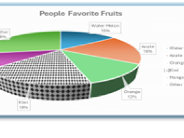
This assignment was arranged in 3 parts to engage students in the process of collecting data, analyzing data, and using it to make a point which wasn’t necessarily what the raw data was suggesting. In the first part, students picked a question and surveyed their peers to gather enough data to create various graphs (by hand!) showing the distribution of their survey results. The second part of the assignment had students work through a LONG list of instructions to recreate several different types of graphs in Microsoft Word, as well as explore the settings and chart elements that control the look and feel of a chart. In the third part, students were tasked with picking an opinion about their data that was not necessarily in agreement with their results and use what they had learned about misleading graphs to skew their graph to prove their chosen point. Some of the ways we looked at to create a misleading graph were changing the scale on the vertical axis, removing the scale all together, using bold patterns and colours, making a graph 3D, and the use of whitespace or crowding. The students created both a normal/proper graph as well as a misleading version to demonstrate their learning.
STUDENT REFLECTION: The misleading graph project helped us to learn how to recognize what makes a graph misleading in real life, and also how to make them ourselves. We went through a lesson to help us understand what makes a graph misleading and how common misleading graphs are in the daily media. While making this project I learned how easy it is to make a misleading graph after we had reviewed what to look out for and I realized that the general public who haven't taken lessons or know what to look out for could be easily misled and fed misinformation that can harm their work life and personal life. I really enjoyed the process of making the misleading graph, which topic I could choose, tallying up peoples votes for my raw data. That was fun, and everyone in our class participated in answering each other’s questions. We even asked people all over the school and in different classrooms as well. I did not enjoy the part where we had to learn to make the different graphs in Word since I had some issues with the tech and the instructions. It felt tedious to make so many graphs, but when it was finally made and all the set-up work had been finished, both the misleading graph and the original looked really nice and professional. This is something that I'll always carry with me in my day-to-day life as misleading graphs are everywhere. To make my graph misleading, I played around with the way the circle was formatted and disconnected the orange part of the circle (skittles) to emphasize it taking the viewers’ attention and the way I changed the format of the circle made the orange look bigger than the blue part (Twizzlers) because orange is closer.